Hi! Welcome to the nineteenth entry in the KKB History series. In today’s post, Martin will detail some site design changes that were made last week, as well as the reasoning behind them. He’ll also show off some unused assets!
Incidentally, we’d like to thank you all for voting in our previous Patreon poll. As you’ve probably already noticed, the “About” and “Contacts” pages have been merged, per the poll’s results.
All right, let’s get into this post!
KKB History #19: Small February design update — Written by Martin
I tend to do design updates for KKB around its anniversary. That being said, I only just settled on a finalized overall site design a few years ago, so these anniversary updates tend to be small in scale. It’s usually just fixing up weird prior design decisions, or updating a design element that’s become too out of date. That’s actually the reason behind this month’s design update—one of the page elements had become a bit too old.
The element in question would be KKB’s page headers; I’ve remade them time and time again, and yet, I’ve never quite figured out the best way to do them. I’d say it’s a little too early to tell if the current redesign will be the final one, since I had quite a bit of trouble working this one out as well.
The page headers themselves have gradually gotten smaller with each update. When KKB first launched, they took up the whole screen. After a while, I scaled them down to a height of 400 pixels. A year later, that went down to 300 pixels. Finally, with this update, I set them to 200 pixels tall. My reasoning has been the same throughout: I’ve found the headers to be a bit too large.
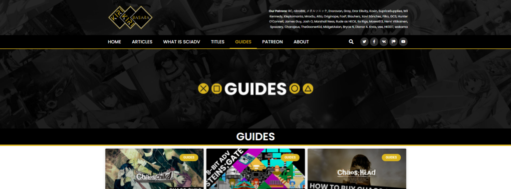
As an example, here’s the Guides page’s old header. As you can see, it covers a lot of screen space, space which could be used for more important content; it also doesn’t really improve the overall design.
This example also has another big issue: there are three total instances of the text “Guides” in close proximity. Usually, a single indicator of the page title is enough, with multiple being unnecessary. Many other pages had similar issues with repetitive text.
Another example of a broken header: the “Articles” page’s header used to say “News.” The reason for this is that the Articles page contains all of our written content in one place—we used to label this our “News” page, since most of our content is news-related, but because we do also have other content, such as reviews and guides, it made more sense to use the general “Articles” label. The header just never got updated to account for that.
Naturally, a change was in order—I decided to fix those headers for good. I began prototyping in Photoshop and came up with a few examples for testing purposes.


My first instinct was to go with a fancy design, but I eventually settled on the concept of “less is more.” Each page got its own simplistic header, which I feel ultimately turned out looking quite nice. They’re straightforward, follow our color scheme, and clearly convey what page the reader is on.
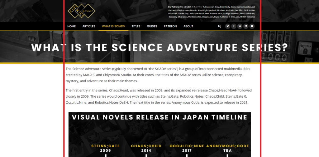
I will note that one header still needs additional work: the “What is SciADV?” page. The text is too long, and as a result, it doesn’t fit the invisible border of the site. Aside from this, though, I feel everything turned out rather well.
There is one feature I’d love to set up sometime—it’d be cool to have headers that display a different background image every time the reader loads the page. I’m actually already testing this out on the Articles page, where there are currently ten different background images in rotation. The header image should change every time you reload the page, which I feel makes the header itself a little bit more interesting. You never know what image you’re going to get.
The featured images in question, by the way, are different CGs from the SciADV visual novels—specifically, ones that are used as backgrounds in them. I use these for KKB Update thumbnails as well, since they look quite nice. There’s a ton to appreciate among them—my favorites come from Chaos;Head Love Chu☆Chu.
And that wraps up this month’s KKB History update! As always, we’re grateful for your continued support. If you want to reach out, feel free to contact us via email, or through our social media pages. Thank you very much, and see you next month!
Original Patreon post: www.patreon.com/posts/62905076
KKB Community
0 comments