
Chaos;Head has a unique atmosphere compared to other SciADV titles; personally, I don’t think any other title in the series came close to it. It is dark, depressing, and makes you question reality. That’s not just thanks to the superb story and writing, though—its presentation plays a big role, too. You can write the best story in the world, but more often than not, how you present it to the audience is also important.
Check out the video or read the article below.
It is no secret that the original Chaos;Head had to be made on a very tight deadline, as discussed back in the day on a CD called Chaos;Head: Delusion Radio Station. As a result (or perhaps intentionally, to some extent?), the quality of the backgrounds was low, the game’s interface was minimalistic, and background music was used sparsely. Except, this is exactly why Chaos;Head is such a great, suspenseful horror thriller.
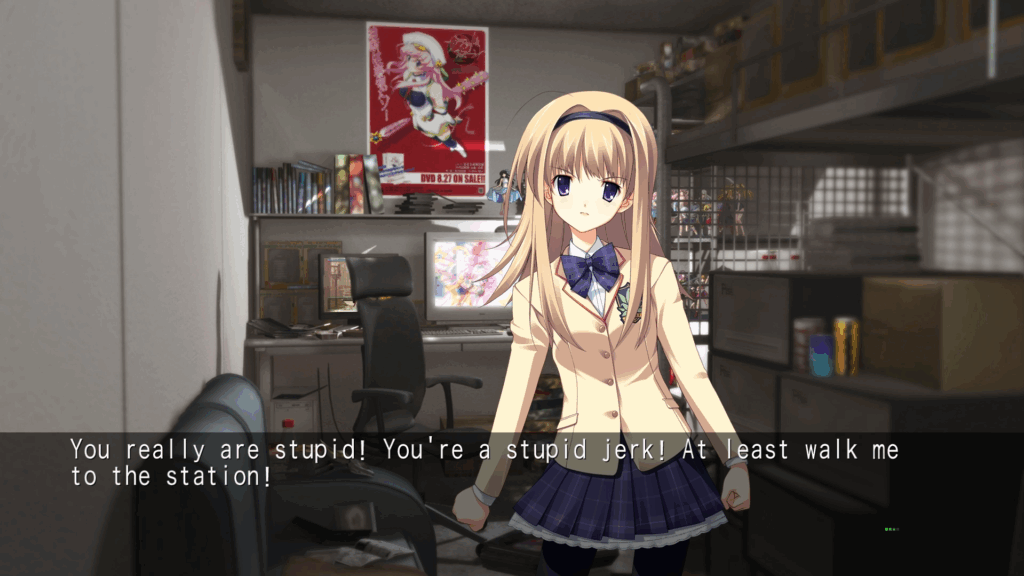
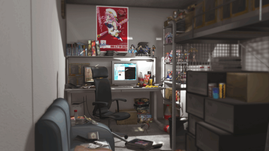
Probably half of the game takes place inside a shipping container that the protagonist Takumi calls home, which in itself is depressing. The only sounds you hear are hard drive and fan noises from Takumi’s computer. The only light comes from the PC’s CRT monitor. As a result, the entire scene feels very claustrophobic and retro.
In Chaos;Head NoAH, text is presented simply over a semi-transparent gray rectangle, so it feels like you’re reading subtitles to a movie instead of a visual novel. Personally, I’m used to playing games and watching movies with subtitles, so this felt very natural to me, but it might not be a feeling everyone will share. The text also flows very nicely on the screen, with no big chunks of text—just a few sentences on display. I absolutely loved these scenes inside the container, as they created the perfect suspenseful atmosphere.
While the quality of the game’s backgrounds and CGs was improved for the NoAH rerelease, they are still quite outdated, especially those that feature 3D models of background characters and such as opposed to 2D illustrations. They look pretty bad compared to modern standards, and even compared to VNs released in that time period—but I would say that also adds to the charm of the game. Chaos;Head NoAH is old and takes place in 2009, so of course you’ll see weird 3D CGI people and backgrounds. It provides this sort of “retro” feel to the game, which is now approaching twenty years old.
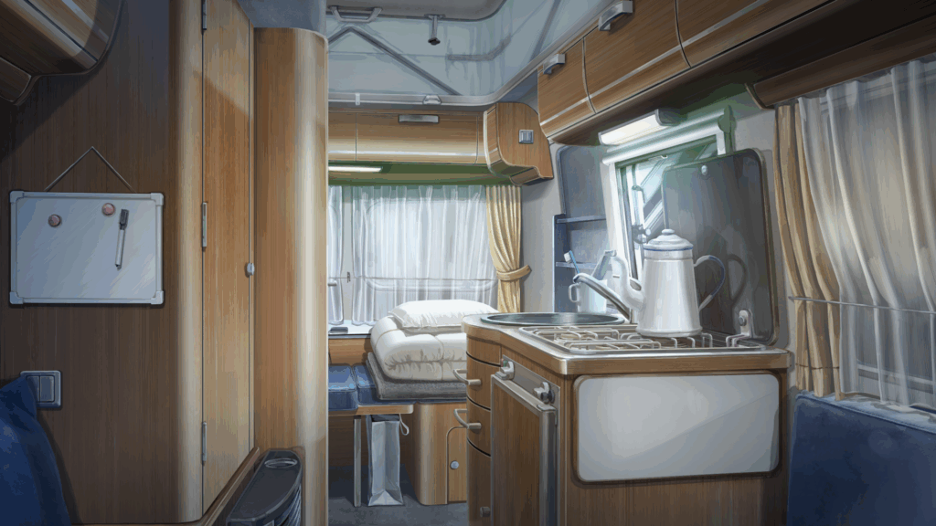
I didn’t really feel that atmosphere when replaying Chaos;Child. That game’s CGs, backgrounds, and character art are just “too nice-looking.” There’s a scene where Takuru is freaking out because he thinks he’s going to get murdered, and he’s sitting alone in his trailer home. But the atmosphere in that scene doesn’t feel that scary, because what you see is a nice, clean trailer with windows, illuminated with light. The scene itself doesn’t look that intense. Now, in Chaos;Head, there are several scenes where Takumi loses his mind in the container, and the atmosphere matches that tone: there are no lights except from the PC screen, no windows, and you only hear the ambient noises from his PC. The scene is presented in this now out-of-date mashup of 3D backgrounds and 2D sprites, giving it a grungy feel.
The same can be said for scenes that take place outdoors. In Chaos;Child, everything just looks too pretty, even at night. In Chaos;Head, though, you have backgrounds that are sometimes 3D, sometimes 2D, and sometimes a weird mashup of both styles that just looks weird. And for a game where weird stuff often happens in the story, it makes more sense that the presentation is weirder than it is nicely drawn.
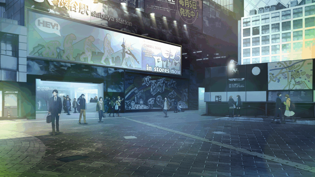
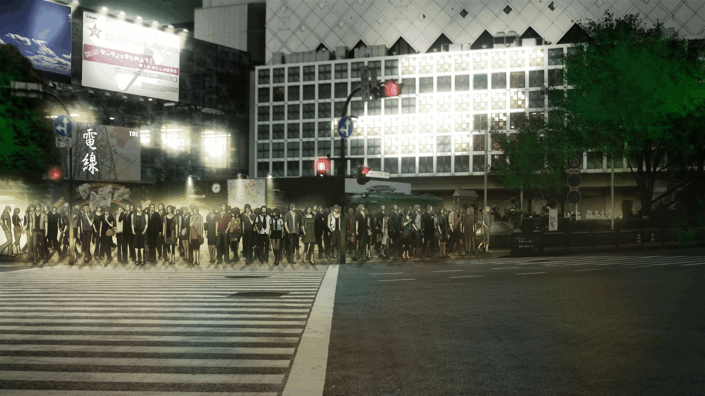
The Shibuya Scramble crossing area, from Chaos;Child on the left and Chaos;Head on right. Even though it’s the same location, just from a different angle, Chaos;Child’s version feels like a regular late-night stroll through a city street, while Chaos;Head’s version feels dark, mysterious, like something uncanny is going on.
The only non-SciADV visual novels I have experienced are Fate/stay night (the original and the remaster ) and Tsukihime (the original). Even there, I never felt like I was experiencing the same tense atmosphere as in Chaos;Head. They just look nice, even though they are over twenty years old. There’s just something indescribable about hearing those PC noises in a shipping container, or witnessing a bizarre half-3D background of the dark streets of Shibuya in 2009.
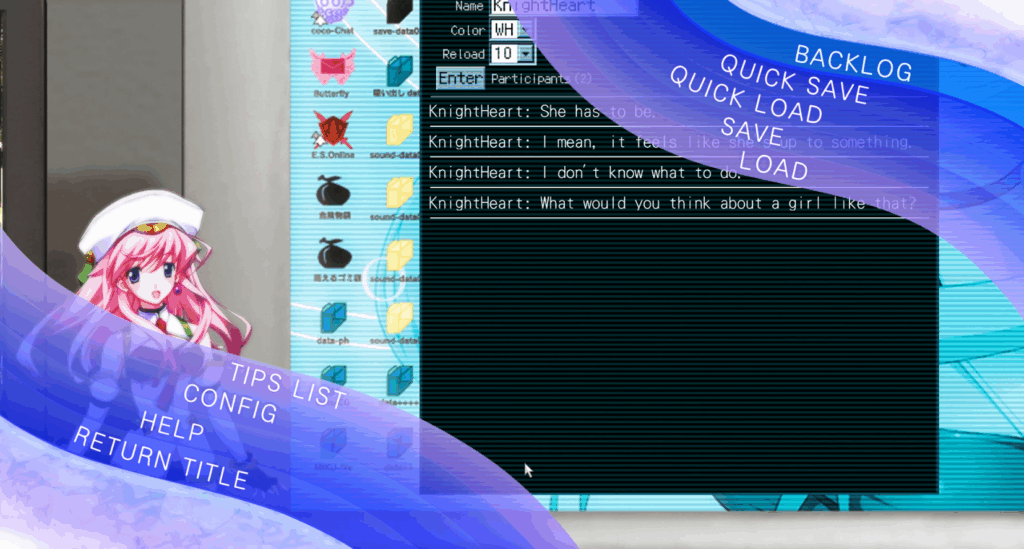
Two aspects of the UI that look a bit out of place in Chaos;Head NoAH are the pause menu and the delusion trigger. The menu is just random purple and pink waves with text on them. I think a menu like Chaos;Child’s would have better suited the game here. The game screen itself would zoom out, and instead of it being in a picture frame like in Chaos;Child, it could be on a computer screen. Personally, I think that would have made the game feel more claustrophobic.
As for the delusion triggers, in the original version of Chaos;Head for PC, you had like a heart monitor pulse going on at the top of the screen; on the top left, a green pulse, and on the top right, red. While the sound effect was weird, I’d say the actual visual was more immersive than what we got in the NoAH rerelease. Instead of the heart monitor pulse, the design is some sort of card or tray, with an overlay of the Shibuya skyline over the screen
While not that immersion-breaking, from a design point of view, it just feels out of place, because it doesn’t follow the same look as the pause menu—nor does it feel minimalistic like the rest of the screen.
With the limited time they had, MAGES. created one of the most atmospheric and intense games in the SciADV series, whether intentionally or unintentionally, and it still holds up great today despite its outdated design. This presentation is probably the main reason Chaos;Head is such a strong and impactful story. If MAGES. ever decides to do a complete remake of the game, I don’t think it’d have the same atmosphere the original game and NoAH possess. There’s just something charming about how “bad” everything looks, and it improves the story and its presentation immensely.


KKB Community
0 comments